May 14, 2011

French red tickings from Alsace

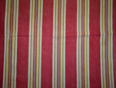
Textile weaving, dyeing and printing was a major industry in the Alsace region of northeast France. Textile factories dotted the region and competed fiercely to produce beautiful colors and patterns on cotton fabrics. The region also produced utilitarian fabrics, including woven mattress tickings in deep saturated tones and in colors not seen elsewhere in France.
In days gone by, bedding was made at home. Homespun sheets and hand-stitched quilts were much-appreciated and highly-valued wedding gifts that were used for decades.
Mattresses were utilitarian items, usually constructed in one of two ways. In the most common type of mattress, the ticking fabric was stitched into a large pillowcase-like covering and then stuffed with straw or other filler. A more simple mattress was made by tacking a single layer of ticking to a board, allowing enough 'give' to be able to stuff straw between the fabric and the board.
Since northeastern France has cold winters, the bedding of the region included cozy feather beds and all sizes of feather-filled pillows. The mattress tickings from this region are well-known for their deep cherry reds and the combinations of reds and rose shades. The broad-striped patterns were generally intended for the large featherbeds, while more intricate stripe patterns were milled for use in pillows, bolsters and various sizes of duvet.
If you'd like to have an Alsace red ticking fabric for your home or for a project, please visit my flagship website by clicking here: www.french-treasures.com

The first picture below shows a stack of tickings from last fall's shipment (all sold.) Below that are several examples of red ticking fabrics from the Alsace region.


May 4, 2011

Color schemes in 19th C French textiles, part 11

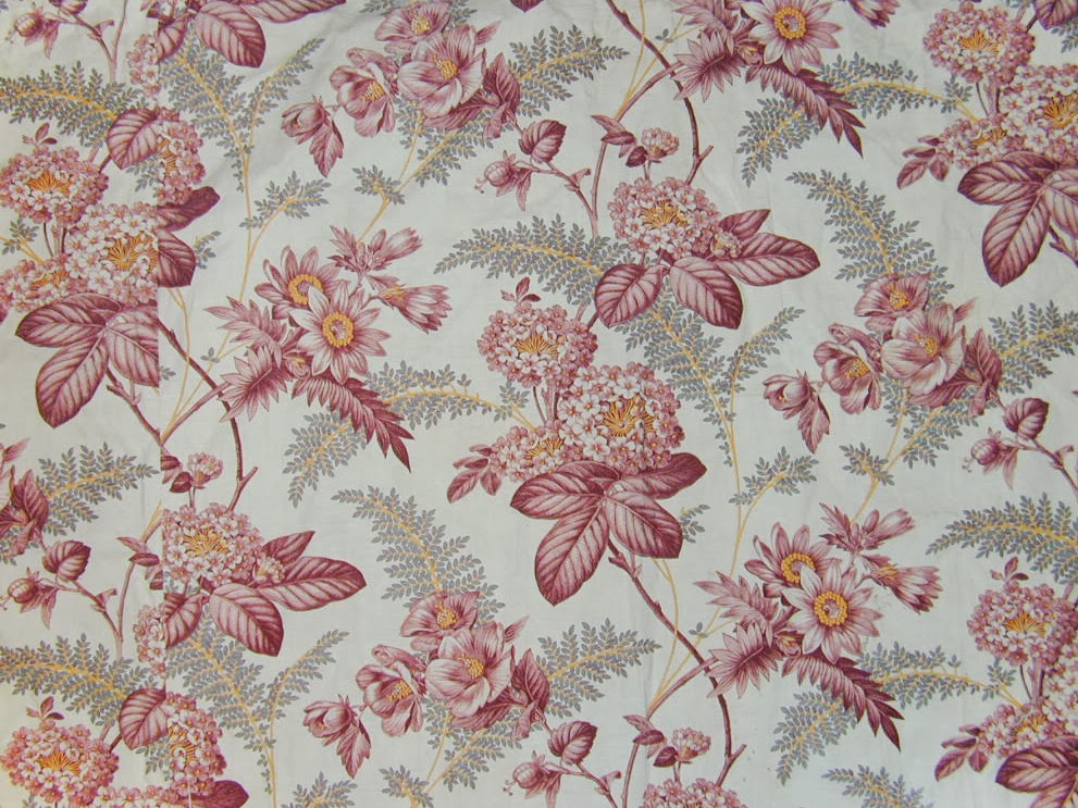
To add examples of the use of the color gray in antique French fabrics, this post follows and expands on "Color schemes in 19th century French textiles, part 7."
Gray was very much favored in delicate or romantic foreground motifs in combination with one or two other colors. Pink and burgundy tones were commonly paired with gray, but other colors were occasionally also used. The five pieces shown below are all from the second half of the 19th century and were printed on a fine cotton. Note the fine quality of the engraving and printing on the first three. These three are prints are exceptional quality.
 

In the next fabric, a three-dimensional look is created by repeating parts of the foreground motif in shades of gray. This printing trick was used extensively in many styles of printed patterns.

One of the more unusual uses for gray was to print a background pattern on cotton - printed so as to look like a moiré silk - thus creating a faux moiré. Faux moiré patterns were printed in other colors also, but gray seems to have been the preferred color. Here are two examples from the mid-19th century. Both these were printed on fine Egyptian cotton, so were expensive fabrics when first sold.